

How might we provide hassle-free and safe daily commute to the employee of any big organisation?
Redesigning website of shuttl for enterprise
01.
THE SUMMARY
Backstory
Shuttl (Super Highway Labs Private Limited
Client Details
1.5 months (From Dec 1st, 2018 - mid Jan 2019)
Time Duration
Website
For Mediums
Teams
Design Research, Interaction Design, & Visual Design
My Role
Content & Research By Prachi Abhiyankar
Visual Design
Shivam Tiwari
UX Strategy
Raghvendra Singh
Illustration
Asif Jamal
Team Setup
Client Introduction
Shuttl is a mobile app-based office commute bus aggregator based out of Gurgaon, India. The company was founded in 2015
Proven expertise in solving office commute for various B2C and B2B businesses. Shuttl has set its benchmark in the market and customers who are using the application regularly. To expand his business in different regions & countries, they need to have a single point lead generation for better tracking and conversion.
02.
Exploratory Phase
Design Challenges
01
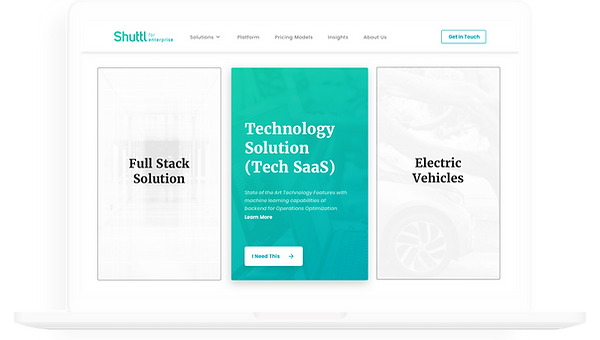
Website redesign needs to demonstrate all the expertise and solution through their content and illustrations.
03
02
The user experience must arouse curiosity in the target group and drive engagement with the shuttl enterprise website.
04
The landing page must engage the user and CTA must be optimized to aid B2B lead generation and conversion
The website needs to solve the user's needs and business goals. Development effort should be minimum.
03.
UX Research
Information Architecture
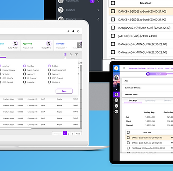
Shuttl for enterprise website element, the signup form, had around 60% dropout before the redesign and needed to be simplified.. The navigation was unintuitive; the links would take the user in an unclear direction. After studying Google Analytics and Hotjar stats for the previous website, we discovered that users would click for more info never to find what they were looking for.
-
We proposed to ease out the website navigation and highlighted the most searched for sections of the website: FAQ and How It Works, for a seamless User Experience.
-
Having a secure and trusted transportation system ensures that the employees don't have to worry about reaching work on time and getting back home safely.
-
Streamline employee commute with integrated fleet management
-
Best class pick up experience
-
Eliminate hassles with round the clock operations support

04.
Wireframing
Strategize
-
Before engaging an agile transformation consultancy, potential clients want to ascertain Shuttl enterprise solution credibility and competency in project and process management. Hence, our primary design goal was to present this information to business leaders and decision-makers in a structured and efficient manner.
-
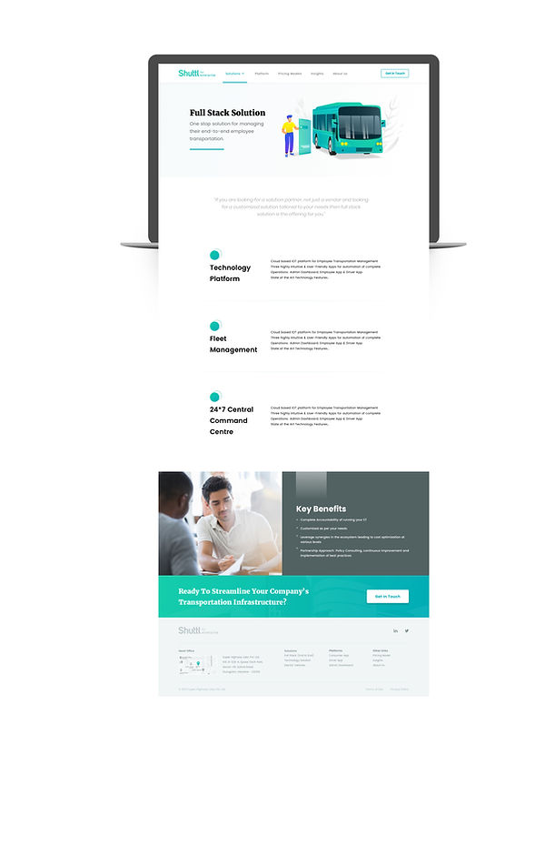
The homepage highlights Shuttl enterprise solution subject matter expertise in helping organizations officially commute solution for theirs employee safety and security.
-
The hero section explicitly states Shuttl's core mission by complementing the colourful visual imagery with an outline of the process and solutions provided by Shuttl.
-
The next section dives directly into offering and details, enumerating the volume of diverse solutions that shuttl actively conducts across the different regions with renowned fleet and tech solutions at the helm.
-
The next section addresses a potential lead’s primary concern: “Is the app based commute model effective in removing commute hassle and security redundancies”?
-
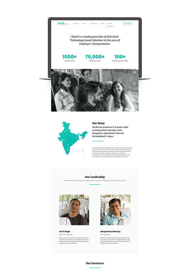
Subsequently, the next section showcases a collection of client testimonials to boost credibility further; we leveraged well-known names such as Honda and MARUTI, who have long been considered the pioneers of the huge employee base shuttle services.
-
In the last section, shuttl finally asks the potential lead to evaluate whether their organization needs an office commute solution and where they currently feature in terms of agility. The rest of the website includes pages such as the ‘About Us’, ‘Solutions 'Pricing', and ‘Platform’ pages structured holistically to provide a detailed overview of the company.

05.
Visual Design
Deliverable
-
We used the primary shade of Teal provided by Shuttl (used in the logo) and paired it with a vibrant shade of green. The Teal conveys creativity and expertise, while the green communicates success, positivity, and growth.
-
We picked the font (Merriweather & Poppins) to create a readable and well-aligned interface responsive across various sizes and display devices.
-
Shuttl wanted to differentiate itself from enterprise-level service providers like ZipGo, Easy Commute, Cityflo, H2O App, Commut, Chalo, Etravelsmart, MeriBus, and Carrotfry.
-
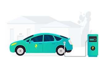
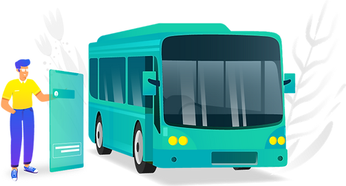
We design fresh new illustrations as our design language and define the story through illustration. Using Illustration of imagery of people working in standard environments; hence we applied custom illustrations throughout the breadth of the website generously.
-
The illustrations also allowed Shuttl to convey crucial elements of the Office environment, outdoor space without appearing too loud and emphasising the human side of organizations. For this reason, most of the illustrations used light shades and emphasized humans' interacting in daily rituals rather than showcase the Humans themselves.
-
We also created a bunch of a custom library of components to keep the design consistent across all pages of the website on all kinds of devices and to ensure that the Shuttl marketing team has a scalable and modular illustration for advertisement and branding purpose that can be easily modified and added upon in the years to come.


06.
Visual Design
Illustrations

Custom-made icons and illustrations are an essential part of Shuttl for enterprise new landing page and other pages.


07
The Result
Success Metrics
We simplified the designs to encourage this relationship and to make the website more accessible and usable. The subtle colour palette makes the experience engaging while still keeping things professional. Here are a few metrics which are in comparison to 5 months old sale representative search patterns:
-
115 % increase in website visits
-
200% increase in conversion rate
-
400% increase in request submissions
- You may also like -